From page to print. Collaboration with Chattanooga embroidery champ, Stitch Effects. After 5 years of operation, Stitch Effects came to me to to create the lettering design for their first piece of official merch. After a few layout tests, we decided on one to clean and vectorize. After a few days, the sample stitch was created and proofs were approved! A very limited run of 20 hats were stitched. Over half were sold on the first day. The remaining hats sold out over the rest of the week. This was an incredibly quick and successful collaboration with an established Chattanooga merch staple!
Jan. 2025
Planograms are the 1:1 map for a product layout in a retail store. Planograms are used to plan and perfect an upcoming product display. Since it is built 1 to 1, all measurements must be accurate. After the planograms are finalized, mounting templates are created to set the products on site. While the templates are created, a separate team creates the 3D renders to give a realistic preview of what the product display will look like in reality.
I particularly like planograms because they start from a blank page and end up in the stores of some of the nation’s largest brands. Many assets and table feautures are created and problem-solved on the fly. This creates an interesting dynamic workflow that leads to a satisfying realistic result.
The MB Commerce system was a large design initiative fast-tracked during the COVID 2020 pandemic. Since dealerships were not able to engage with customers in person, electronic communications with returning and potential customers became especially urgent.
The system required creating spec templates for 4 email formats, depending on user profile, for desktop and mobile. This design system is used to communicate with owner and prospect customers about Mercedes deals, dealer and service information, and other events and information regarding Mercedes Benz.
The Commerce design system also required a hero image creation system using HQ images of Mercedes Benz vehicles. This required creating templates for photo creation, including typography and branding elements, sourcing images, and maintaining a system for desktop and mobile. The system created over 200 unique hero photos for its MVP release.
The Commerce design system was implemented by salesforce developers and led to a sharp increase of sales initiated by email clickthroughs.
Inroads and the AMG are bi-monthly and quarterly newsletters released by Mercedes-AMG. They are important in conveying the company brand, lifestyle, history, and upcoming events for the company. Each newsletter has a distinct style, MB highlighting luxury and AMG highlighting speed and danger.
These newsletters require a huge amount of collaboration, with multiple teams converging on one piece of holistic, branded storytelling.
These newsletters also provided critical information regarding the COVID crisis of 2020. The focus on digital marketing led to an average 20% increase of clickthrough rates compared to previous versions of the newsletters.
View April Inroads
View June Inroads
View Q2 AMG Newsletter
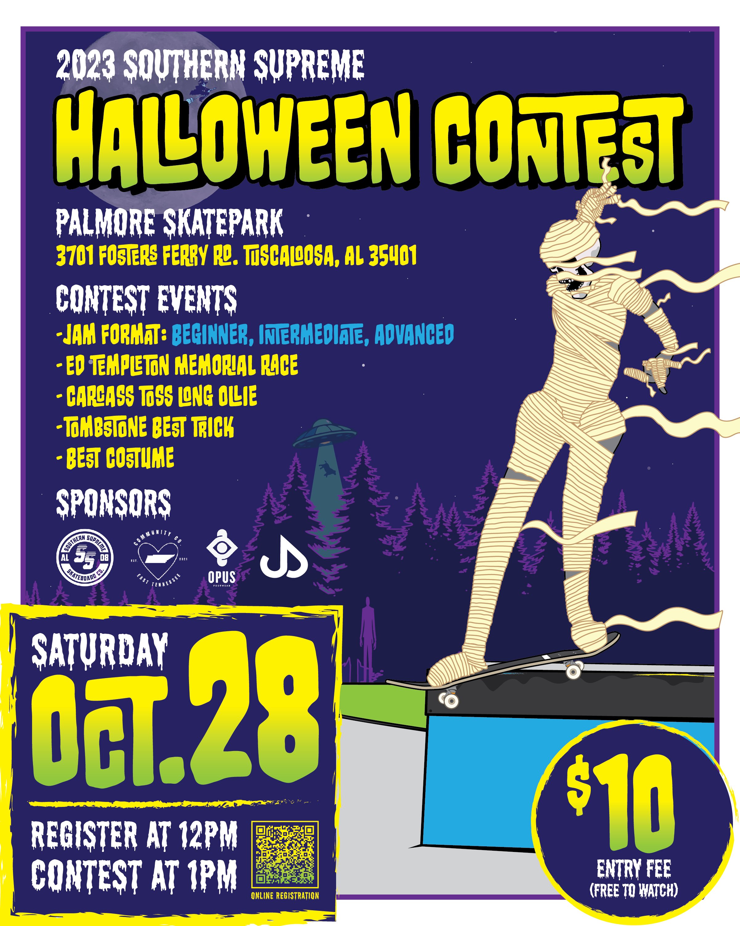
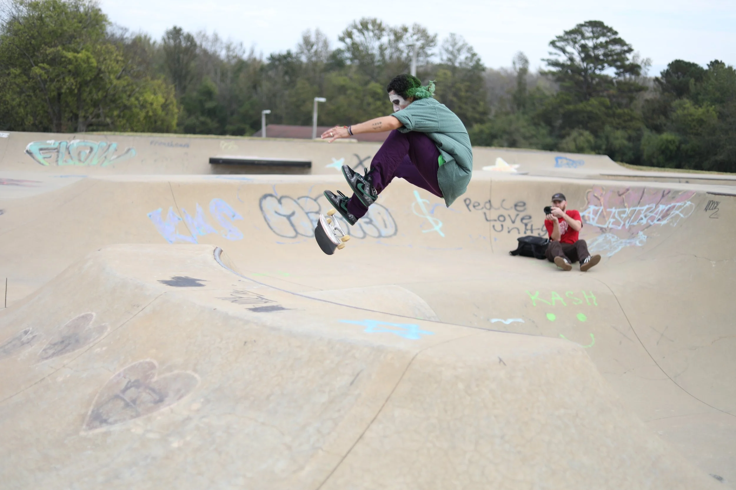
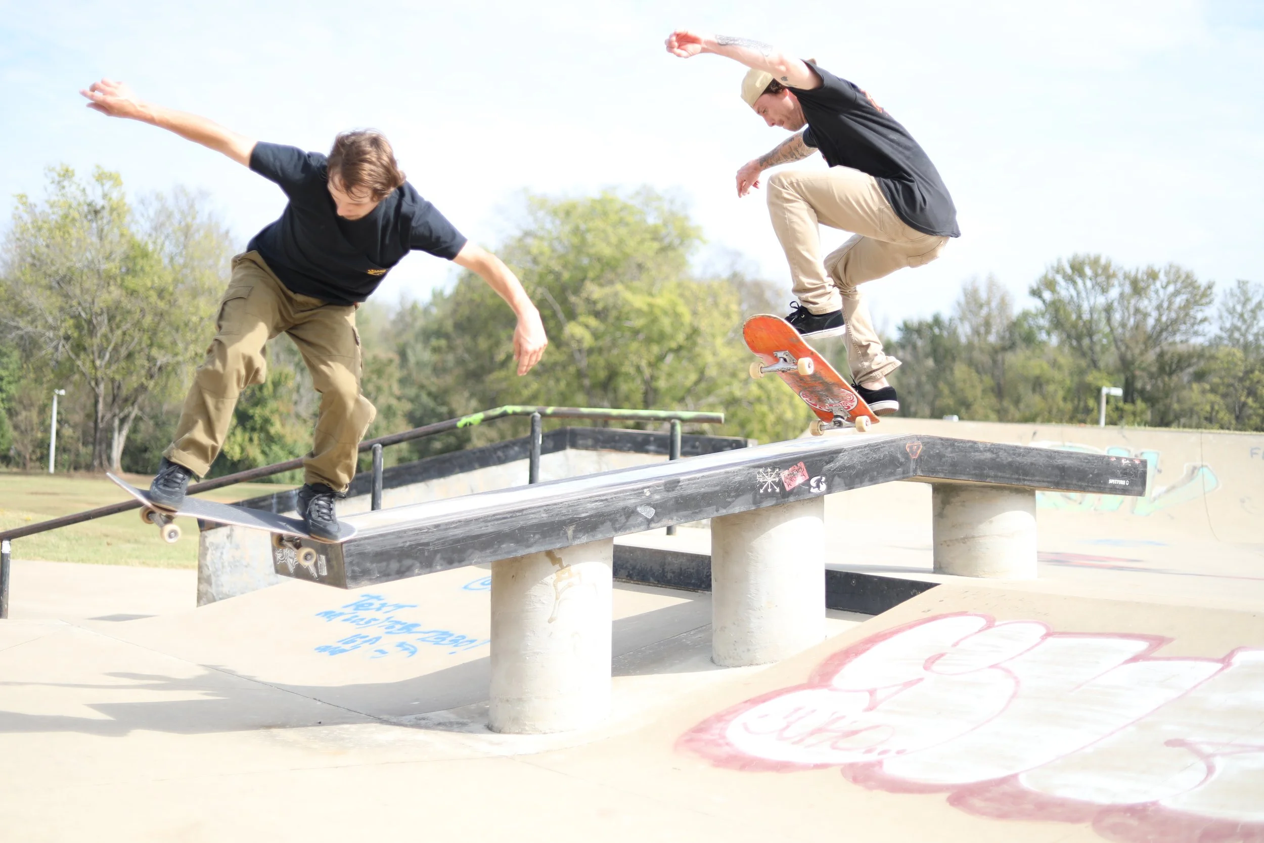
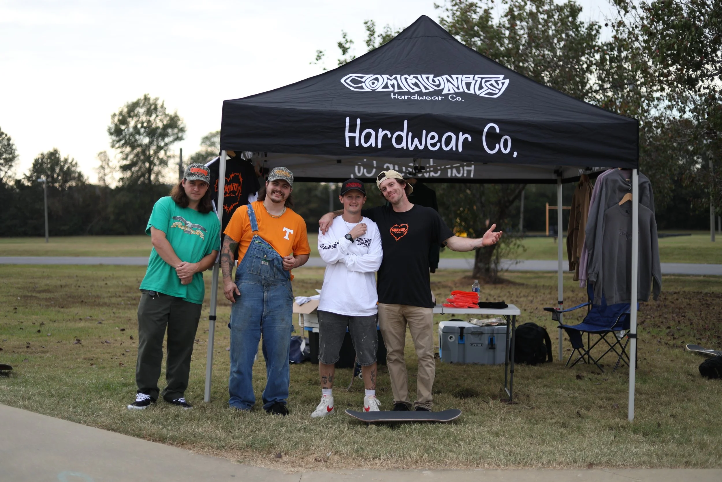
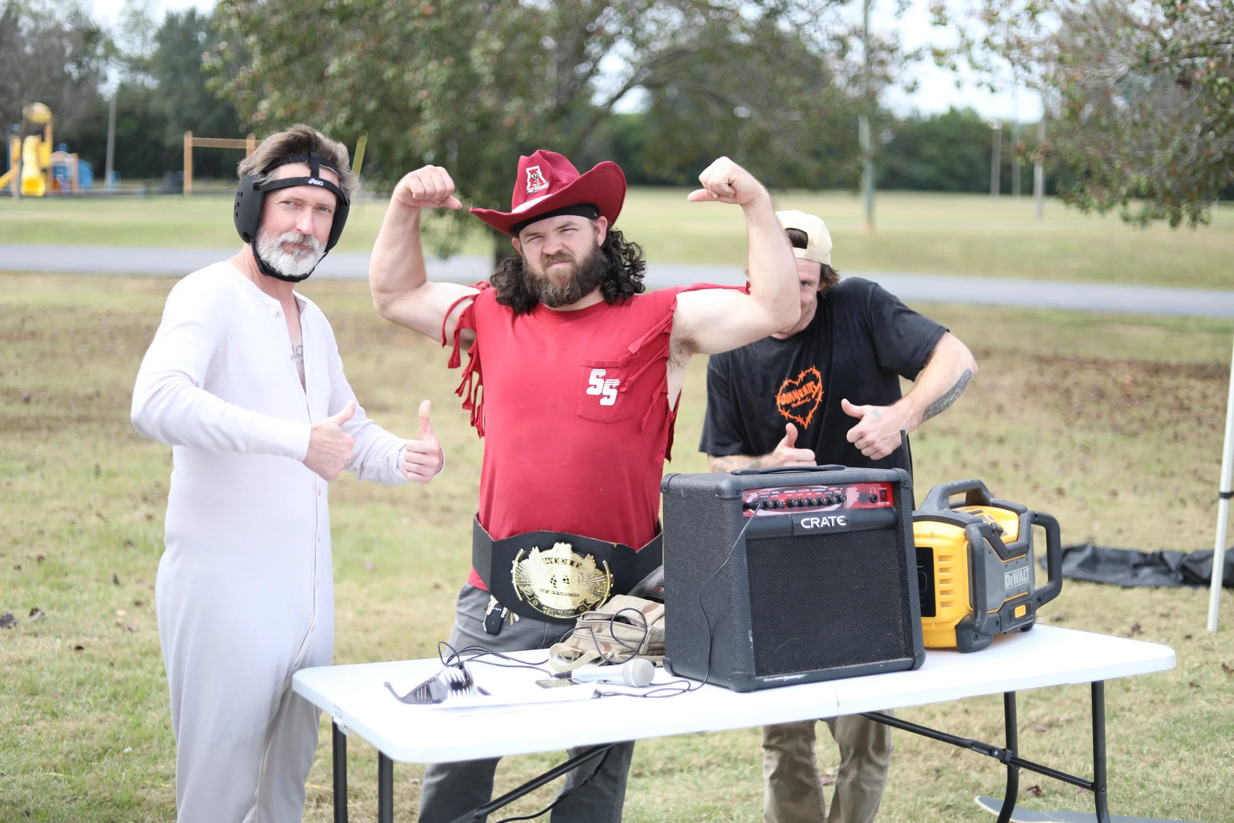
I have created the flyer for Southern Supreme’s Halloween Contest, held in Tuscaloosa Alabama. It is Southern Supreme’s official annual contest. Always a fun event with some of the best in Alabama coming out to represent! Skate and destroy.
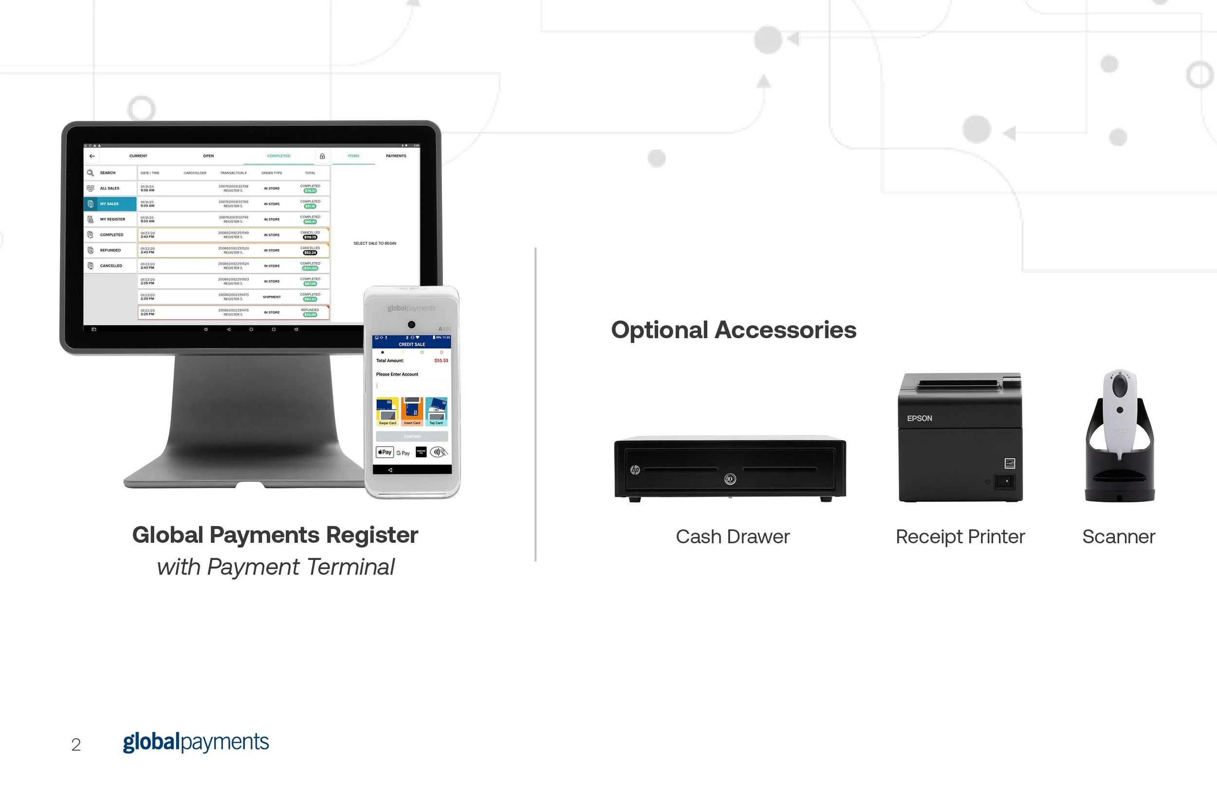
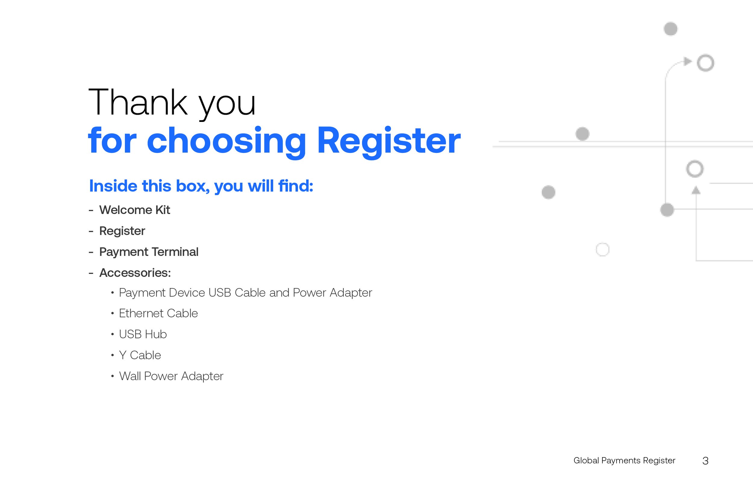
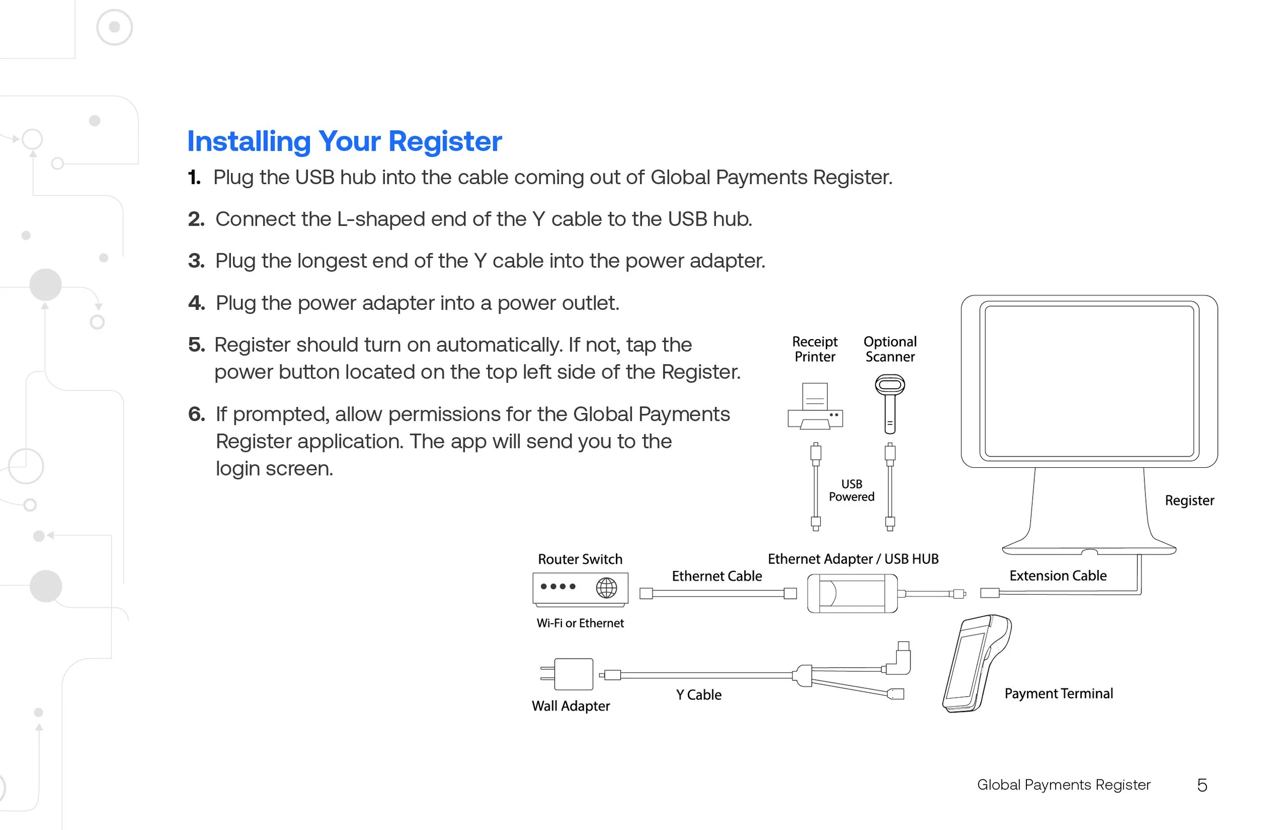
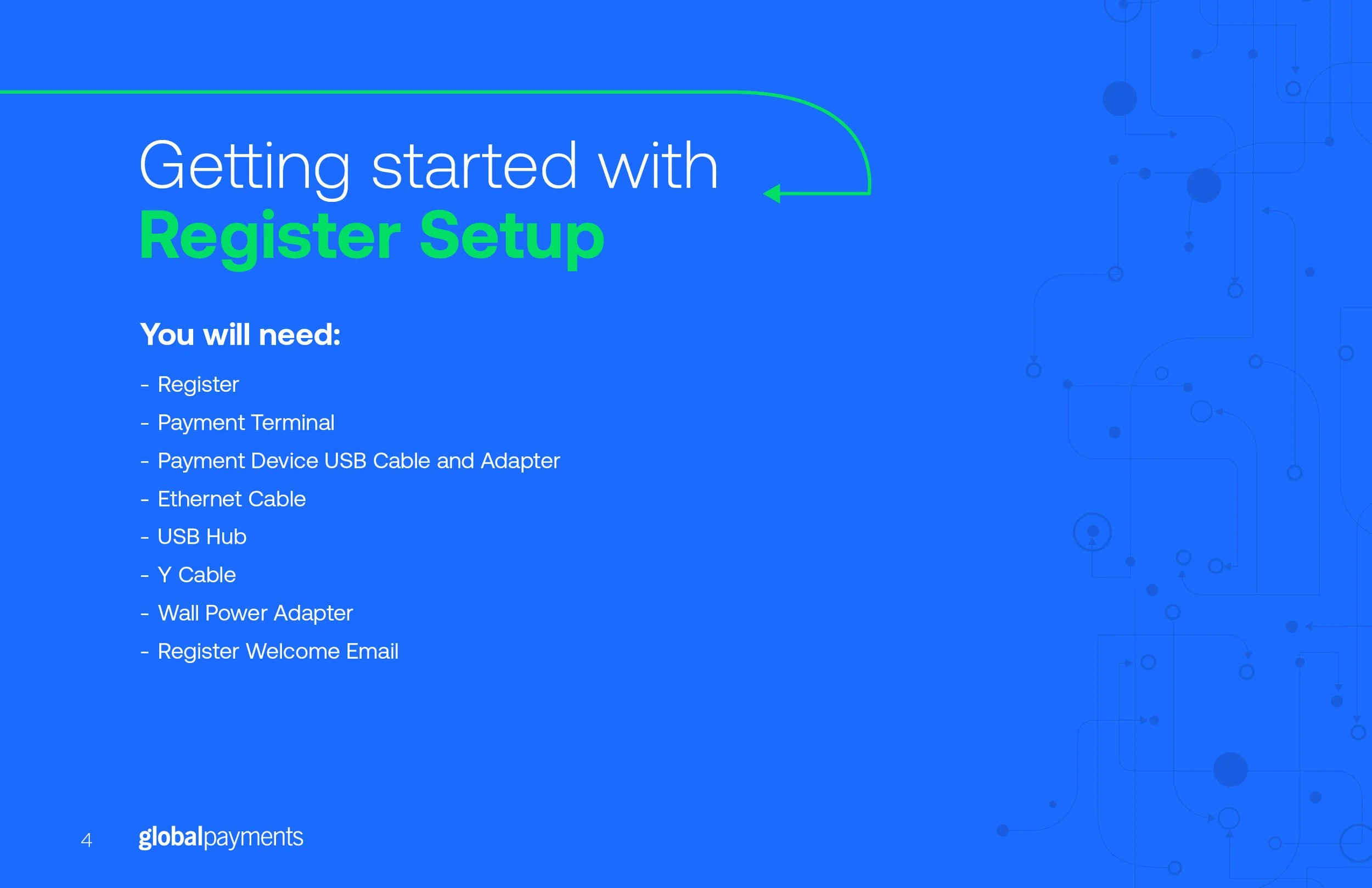
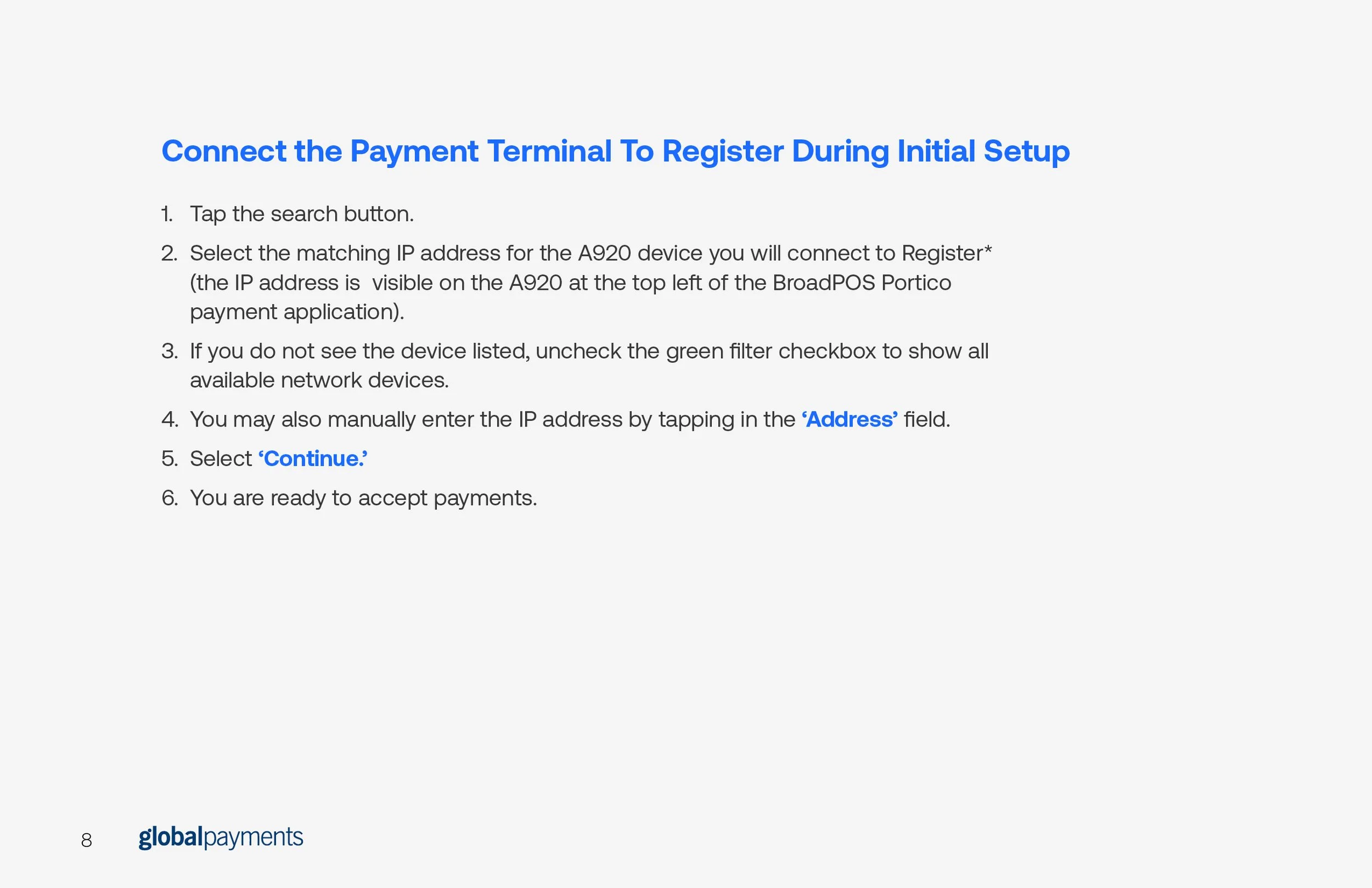
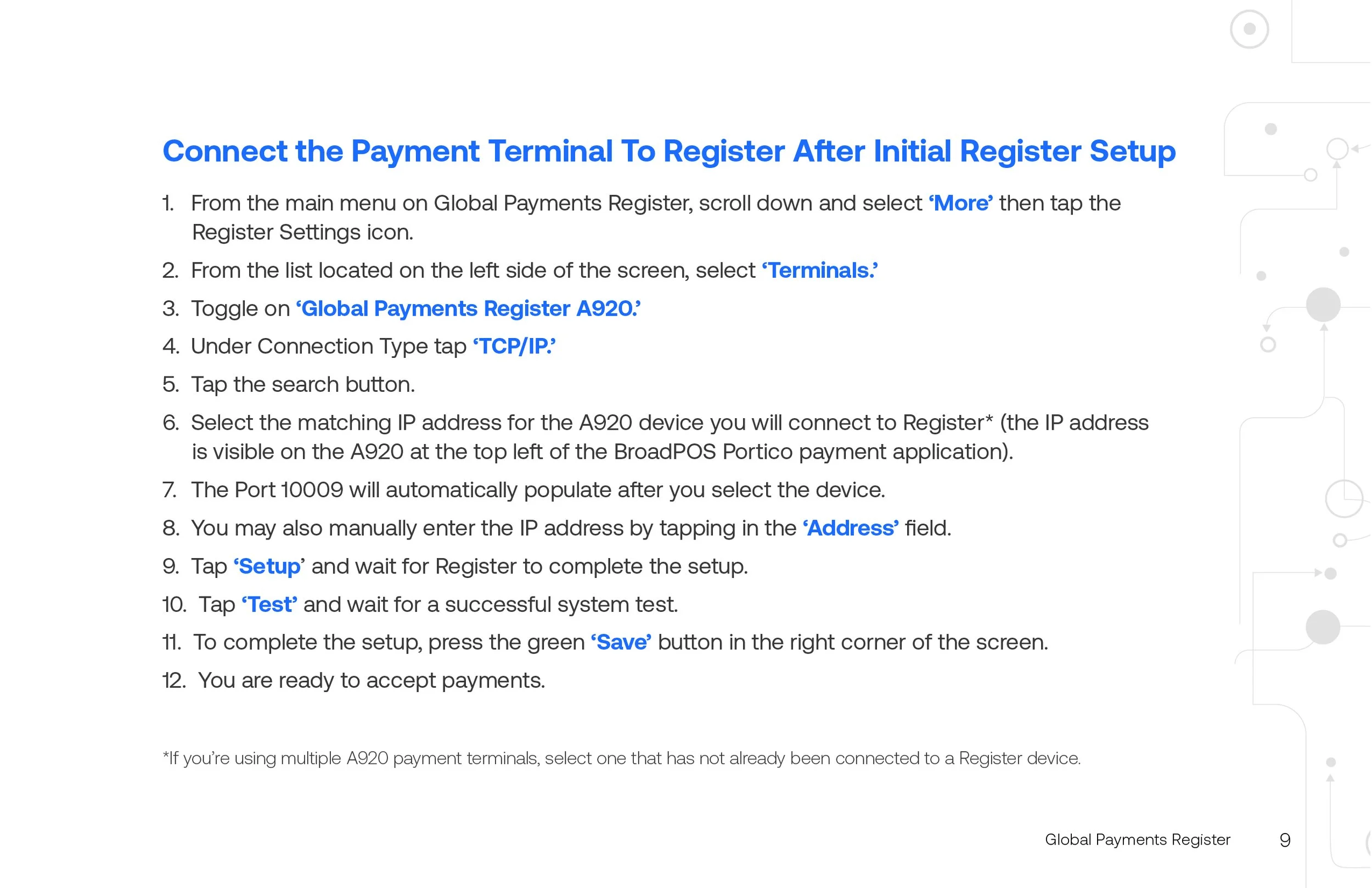
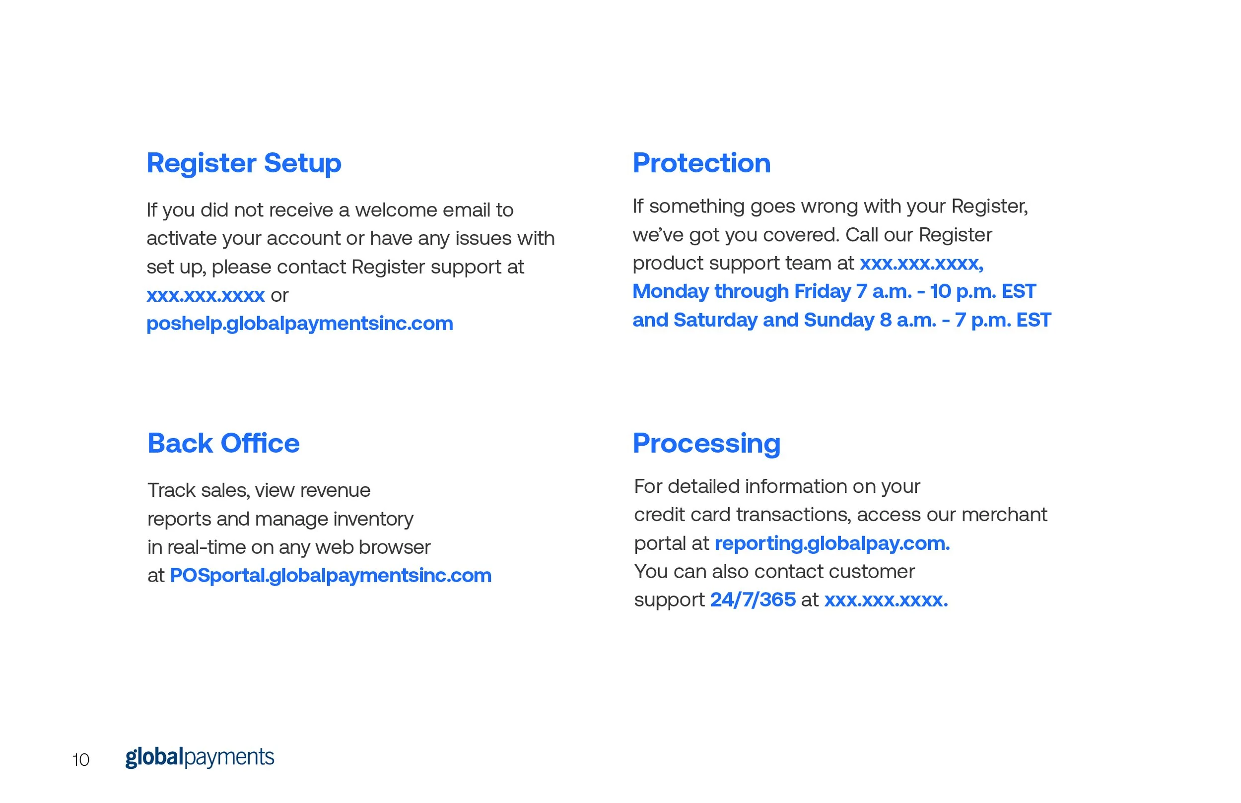
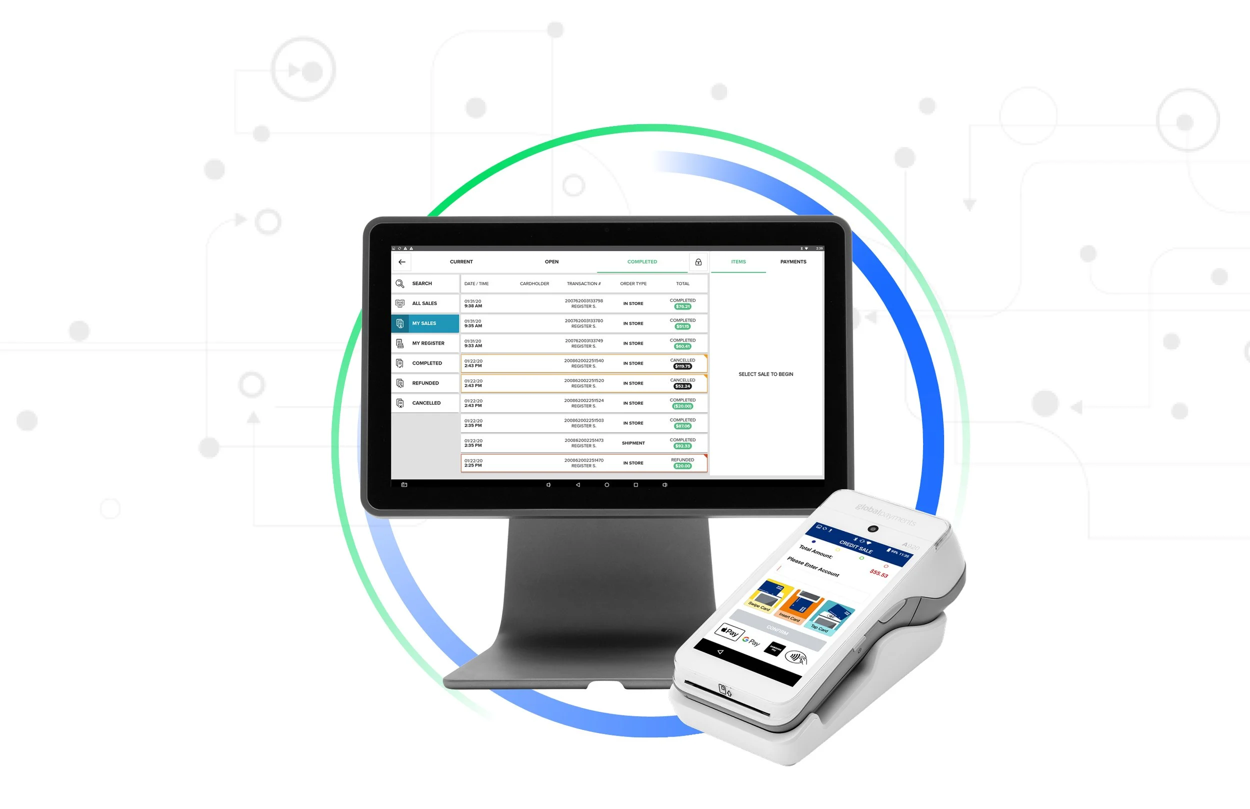
This was a larger print project during my contract with Global Payments, a Fortune 500 financial services company. This guide would be the first piece of branded material a new customer would see. And, since it’s a guide, it must have crystal clear information and messaging so the customer is confident they are setting up the terminal correctly.
This guide was a multi-team effort, requiring multiple sign-offs before going into print production of around 500 guides. Design time was around 2 weeks including some late changes and sign-offs.
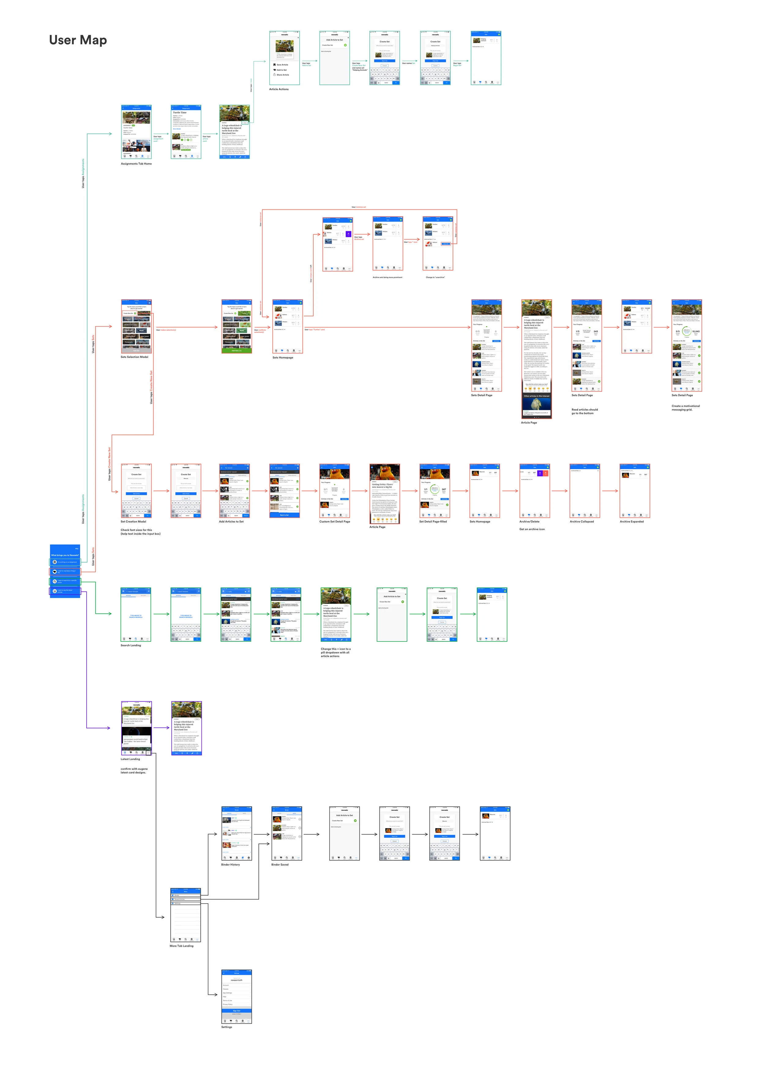
Feature built for Newsela Student, Newsela’s iOS app. This feature can be accessed from the main navigation of the app.
Sets on iOS is an ambitious project that seeks to increase independent reading. We wanted to make reading more fun and feel less like homework or an assignment. So we created a reading system that feels more like a game, but encourages young readers to dive deep into topics they care about. Sets come in two types. Newsela Created Sets, which were researched, compiled, and curated by our content team to be specifically intriguing to young readers. There are also User Created Sets, which allow the user to create their own article compilations based on any topic they choose! Both function the same, but the former offers more structure, while the latter encourages autonomy and user choice.
I acted as the product designer on Sets throughout its entire process. Sets (at the time, called Beats) began as a few pages of user research and static lo-fis created by an outside consultant. The research focused primarily on intrinsic student motivation, getting to the core of what motivates one to read. The lo-fis were just that, very low fidelity screens depicting the Sets main page and category screen.
It was then handed to me to turn into a fully functioning product. I acquired more research on student motivation, along with some competitive analysis, in order to create wireframes and lo fi prototypes. Then, with tremendous help from our user researcher, conducted user testing and interviews with students in order to test our territories and get a first hand reaction to the product’s direction. Sets is the first feature at Newsela to conduct testing with students, which is a fun achievement in itself.
From there, Sets repeated the process of research, prototype, test (internal and external) until we had a fully functioning prototype and updated user flow map, since Sets was to be given its own space on app’s main tab bar. Working with the head of iOS, we optimized the product as it was being developed for release.
Sets is currently live on Newsela Student with a Premium Account.
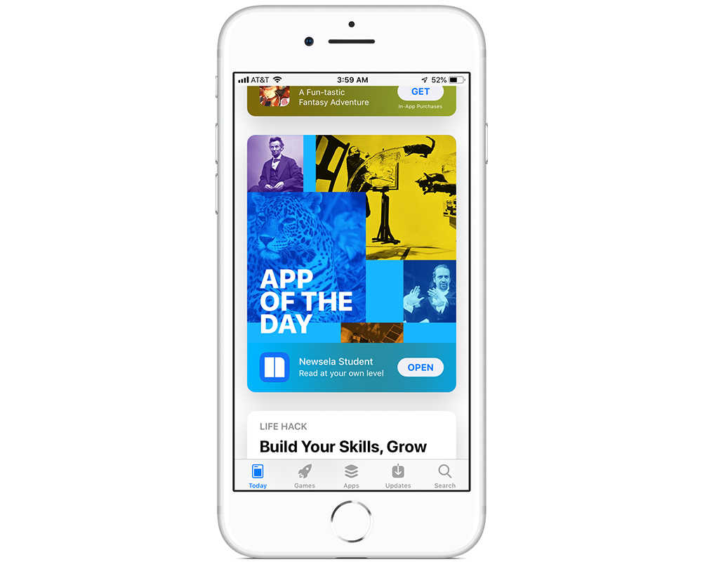
Newsela was the Featured App of the Day in the Apple iOS store in September 2019. This was not just a feature for education apps, this was THE Featured App of the Day.
I, with the help of a few key people, conceived, created, managed, packaged, exported and uploaded the final art assets to Apple with an entire 5 minutes to spare.
This project presented a lot of interesting problems. It required new art assets to be conceived, a very long, very technical requirements sheet from Apple, and a real timeline of 3 days.
After submitting the final images to Apple, we could only wait. Apple held all the cards. We even had to make the files in a way that allowed Apple to move elements and, potentially, completely change the final image that would be used. And that’s even IF they used it. Finally, a month or so later, we received word that Newsela was going to be the featured app on the following day. It was as high stress and technical as a ticket could be! And I’m very proud of my small team, and honestly, myself for getting it done.
View the feature here!
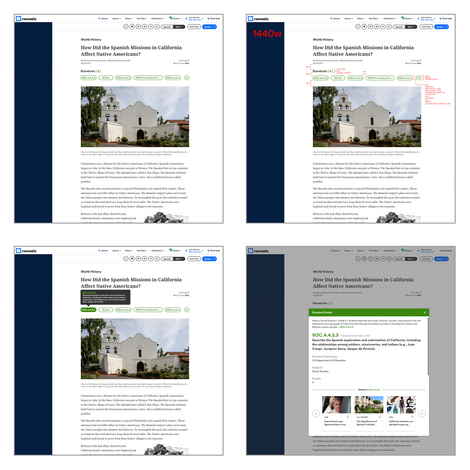
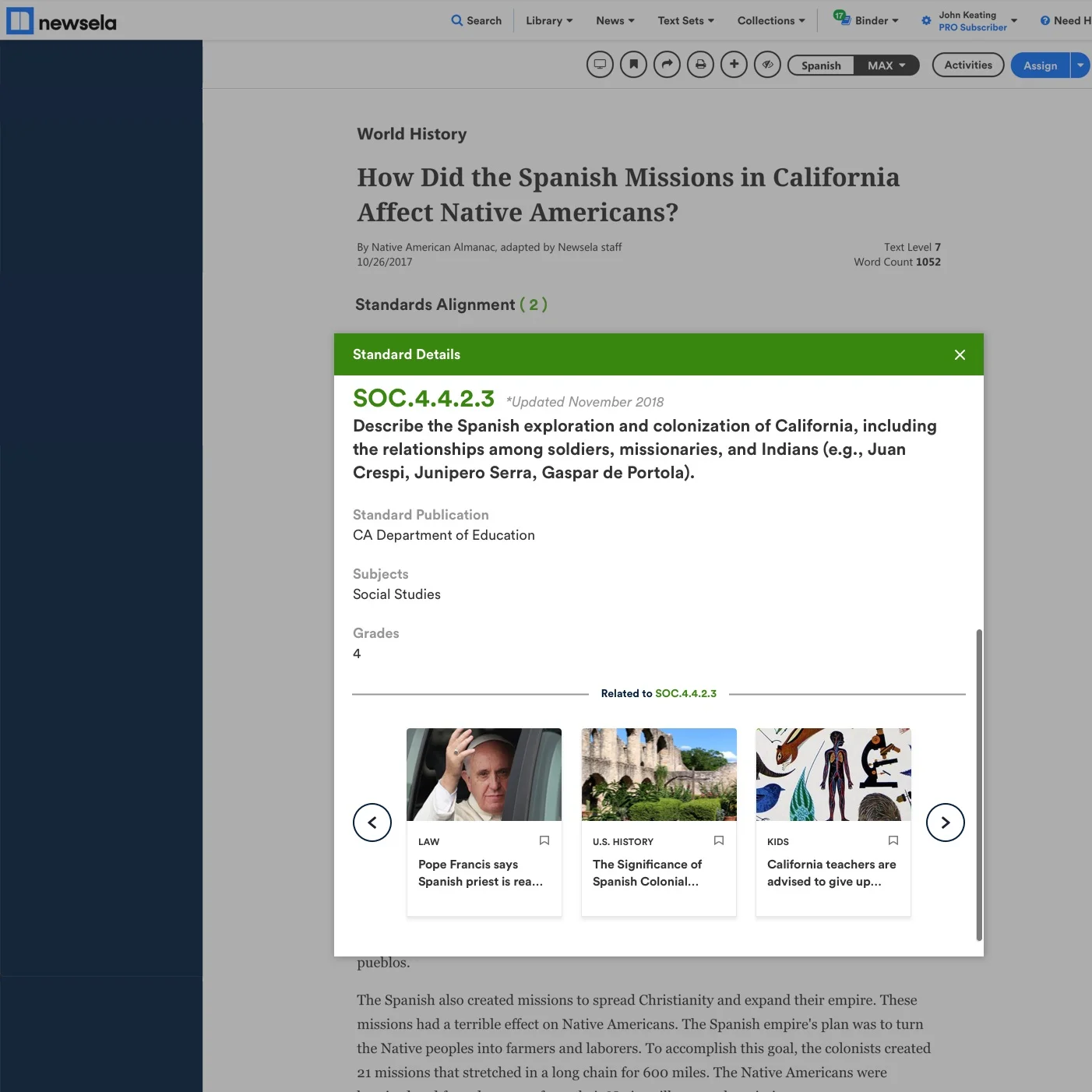
Visual design for Standards alignment represented on the article page.
Standards is a multi-team project that required a shared understanding of the complex nature of national and state learning standards. We conducted user testing early, in order to learn from teachers what information is most valuable regarding standards. This user testing required specific examples to be represented in clickable prototypes. This specificity in unfinished designs allowed us to get specific feedback from many different teachers, broadening our understanding of standards and allowing us to hone our designs to their simplest, most effective form.
On my team, I worked alongside a Senior UX Designer, a User Researcher, and a Product Manager. But, this project had many stakeholders on all teams and levels of the company.
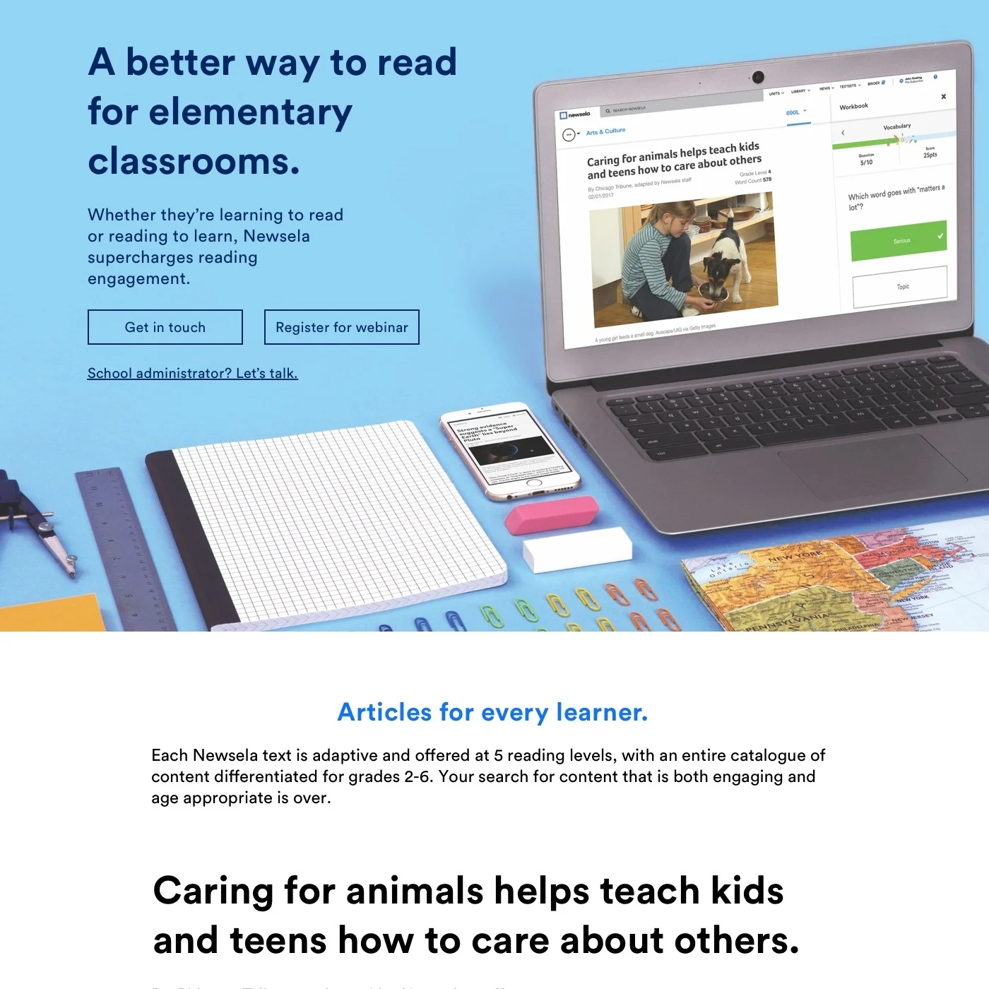
I have designed numerous landing pages for Newsela.com. These had to represent different products, but maintain a cohesive style and tone to create a shared brand experience.
Landing pages required me to illustrate lo fi’s, icons, and other graphics, arrange and retouch product shots, apply brand styles while also expanding upon them, and create the hero images.
Each landing page was also built to be responsive. They work at various breakpoints with specific considerations given to mobile devices.
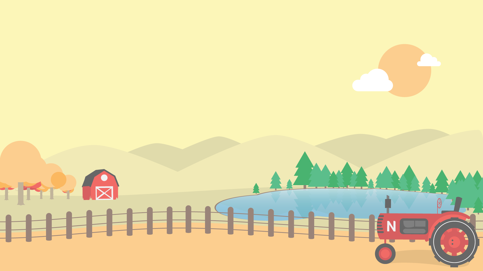
Illustrated vector backgrounds for the Newsela.com Registration & Sign In Page. They were created for different seasons and would change accordingly. Illustrations were also made with responsive breakpoints in mind. So they work well regardless of browser width or device being used. They are fully vector and were converted to svg, making them easy to implement in code while maintaining maximum image quality.
Students’ Vote Campaign from the 2016 election. Newsela partnered with Rock the Vote among many others to gain mainstream attention for the students’ election day. Over 380,000 students cast their vote in this monumental online election. Marking the campaign a huge success in student engagement and built awareness of civic duties.
My responsibilities included building the landing page for the election. This required me illustrating new assets, including the main logo lockup, and branding a look outside of the regular Newsela brand. After the success of the election, I created an infographic in order to summarize the details of the campaign.
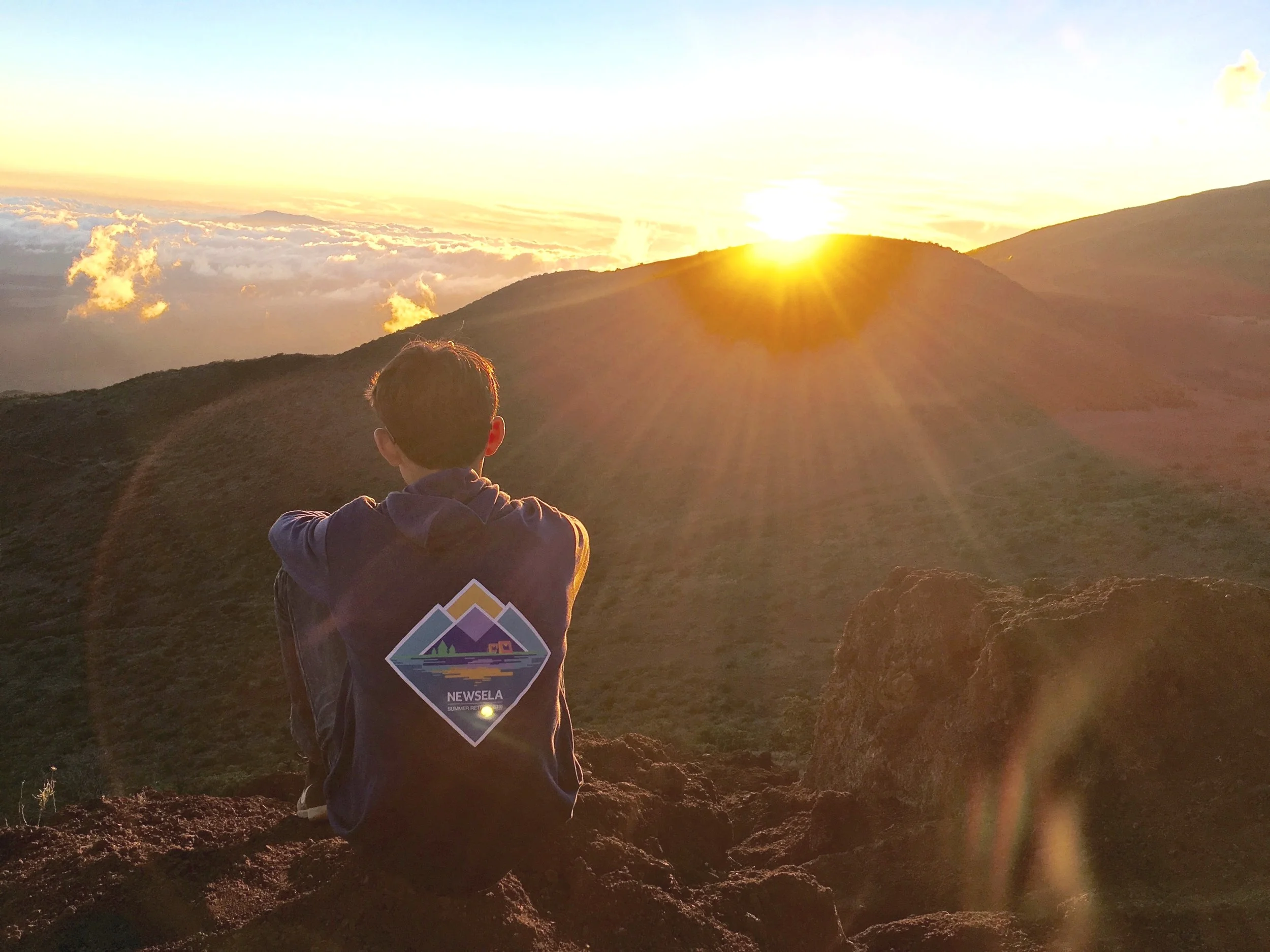
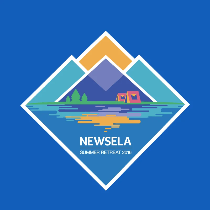
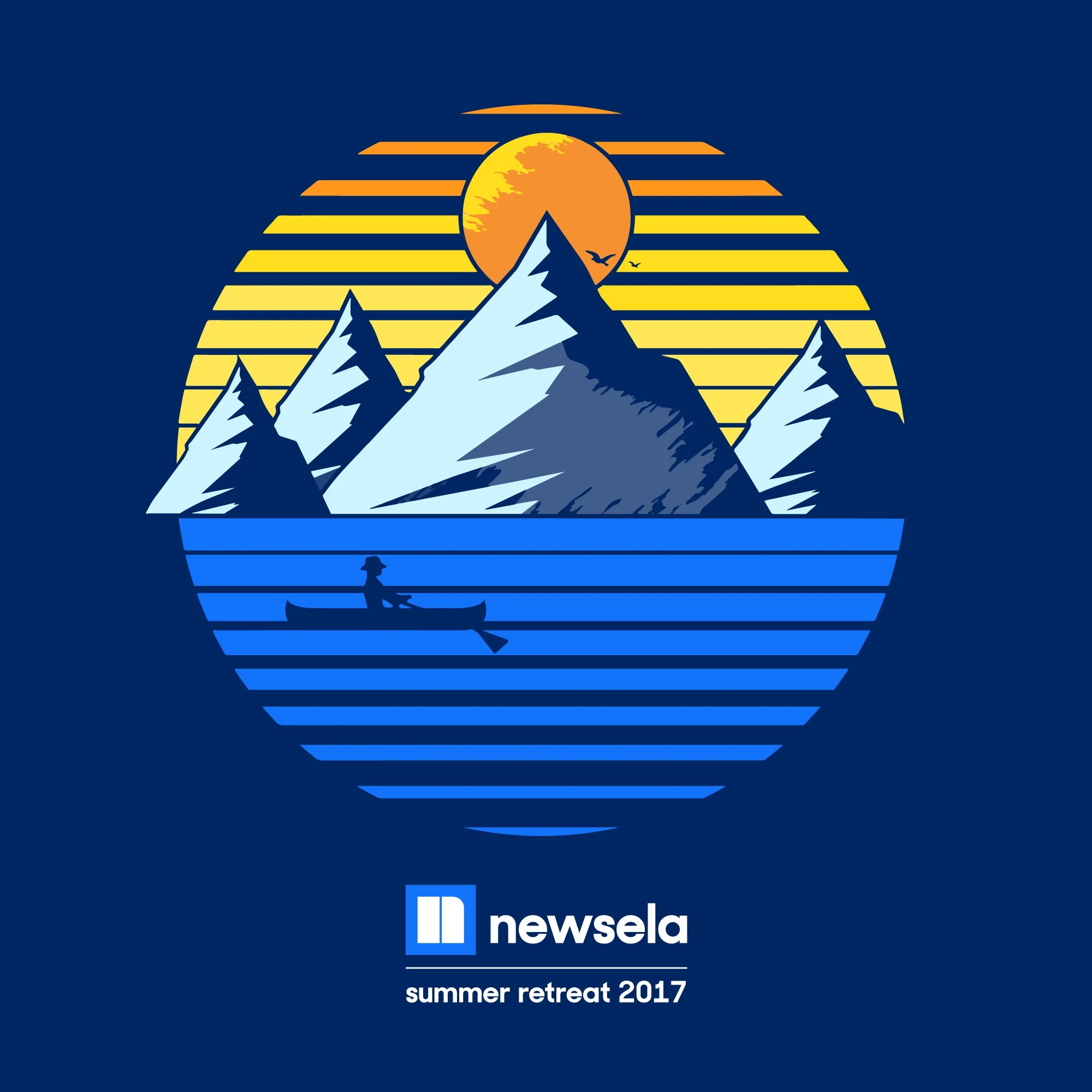
Illustrated and produced the first 3 Newsela Summer Retreat hoodies.
Each summer, Newsela would trek to mountainous regions outside of the city limits in order to hush the noise of New York and come closer as a team. Since you had to actually attend the retreat to receive one, the retreat hoodies became a huge part of company culture! A vintage hoodie meant you were a Newsela veteran - a badge many continue to wear proudly.


